2025’s color trends aren’t just about aesthetics—they’re deeply rooted in cultural shifts, environmental awareness, and a growing demand for personalized spaces. Advanced interior design today goes beyond selecting a single color for a room; it’s about mastering the interplay of tones, textures, and light to create dynamic, transformative environments.
If you’re ready to refine your design strategy, this guide breaks down 2025’s top color trends with actionable insights for advanced application in luxury spaces.
Key Takeaways
- Color psychology is key: These trends prioritize emotional impact and well-being, with warm tones offering comfort and bold hues sparking creativity.
- Layering is the new standard: Combine textures, finishes, and tones within the same color family for depth and sophistication.
- Sustainability meets style: Earth-inspired hues align with a shift toward organic materials and sustainable design practices.
Deep Dive Into the Trends
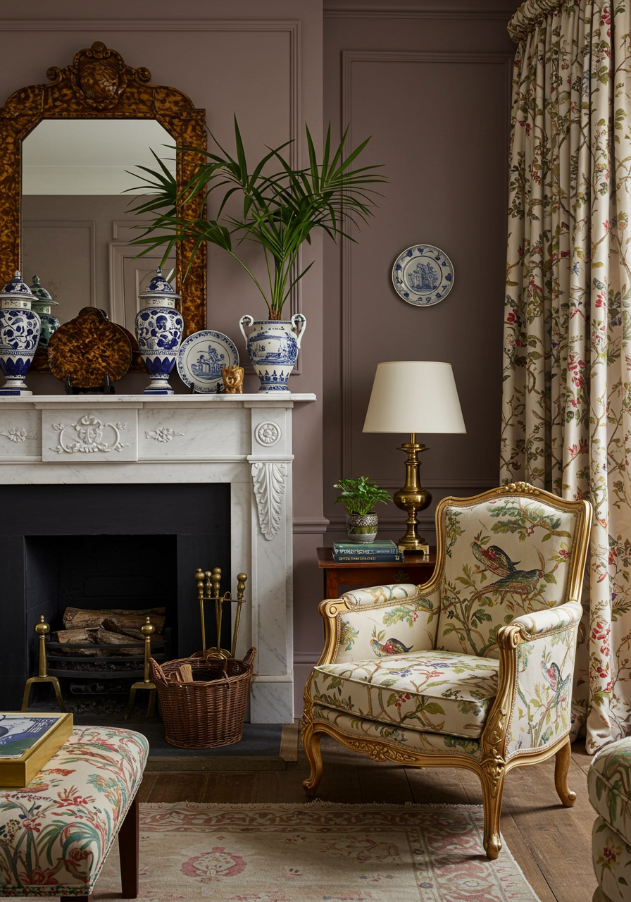
1. Dessert Browns: The Foundation of Comfort
Warm browns like caramel, mocha, and toffee create a grounded and inviting atmosphere. These colors thrive when paired with tactile materials such as leather, wool, or unfinished wood.
Advanced Tip:
- Use brown as a base layer in open floor plans to create continuity. Incorporate contrasting accents like brass fixtures or creamy whites for balance.
- Experiment with matte finishes to highlight the richness of the color, especially on cabinetry or statement walls.
Why It Matters:
Dessert browns evoke nostalgia while blending seamlessly with the biophilic design trend, emphasizing a connection to nature.
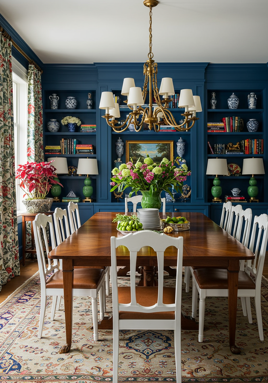
2. Otherworldly Blues: Depth Beyond the Surface
Deeper blues like cobalt and sapphire demand strategic use to avoid overwhelming a space. These tones work well in rooms with abundant natural light or as moody backdrops in high-end libraries and dining spaces.
Advanced Tip:
- Combine with metallics—gold and aged brass—to amplify sophistication.
- Incorporate velvet or silk in these hues for added depth and texture.
Why It Matters:
These blues anchor a room, creating a sense of calm and focus while maintaining a bold, luxurious edge.
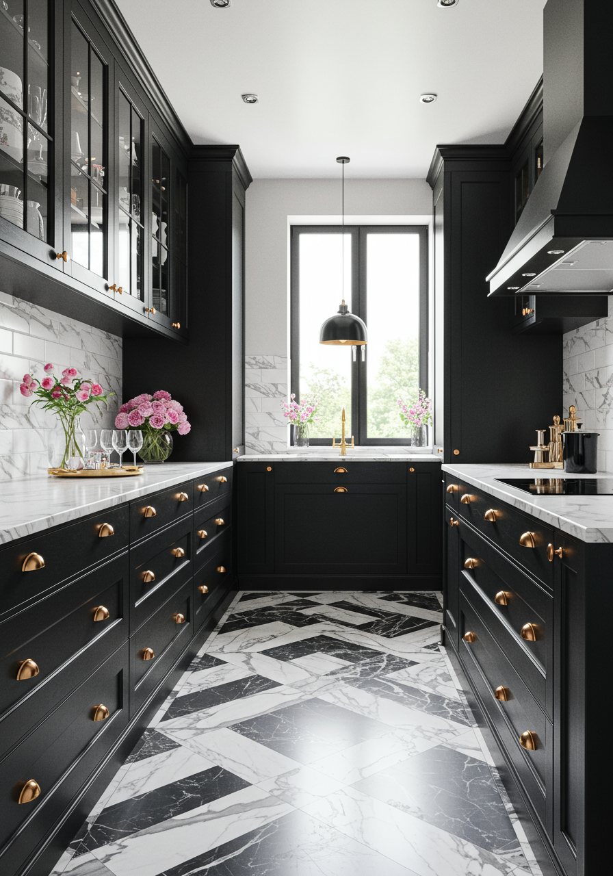
3. Bold Ebony: Drama Through Contrast
Ebony hues, including black olive and rich espresso, bring depth and drama. These shades are ideal for creating contrast, but they require balance to avoid feeling heavy.
Advanced Tip:
- Use ebony in high-gloss finishes for a modern, reflective quality, or opt for matte for a softer, industrial vibe.
- Pair with textured neutrals like boucle or linen to offset the intensity.
Why It Matters:
These tones add gravitas and structure, perfect for defining zones within open-concept spaces or highlighting architectural details.
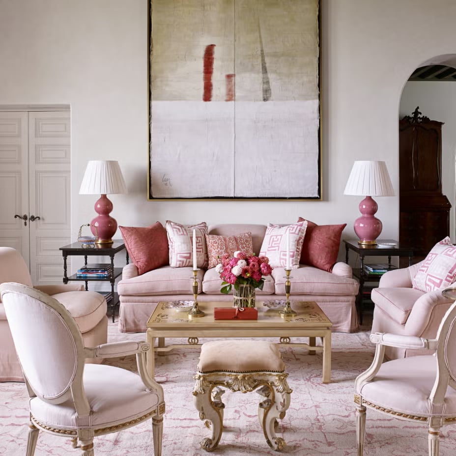
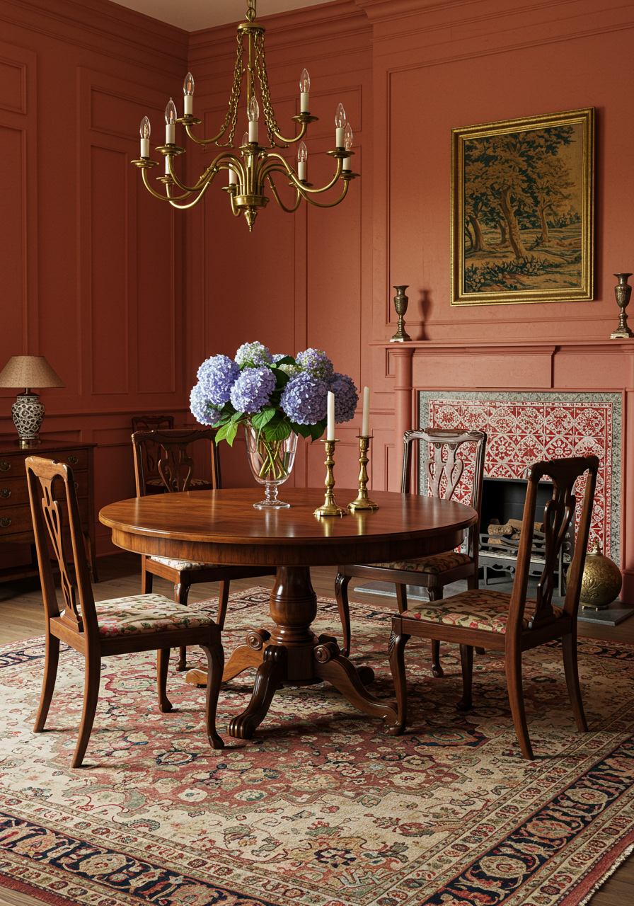
4. Ravishing Rubies: Energizing Statements
Ruby reds and berry tones are ideal for creating focal points. They evoke passion and creativity but should be used sparingly to avoid overpowering a space.
Advanced Tip:
- Layer ruby tones with analogous colors like deep oranges or muted pinks for a cohesive yet dynamic look.
- Use as an accent in furnishings or art to draw the eye without dominating the space.
Why It Matters:
Red is a power color that stimulates conversation and energy, making it perfect for dining areas or creative spaces.
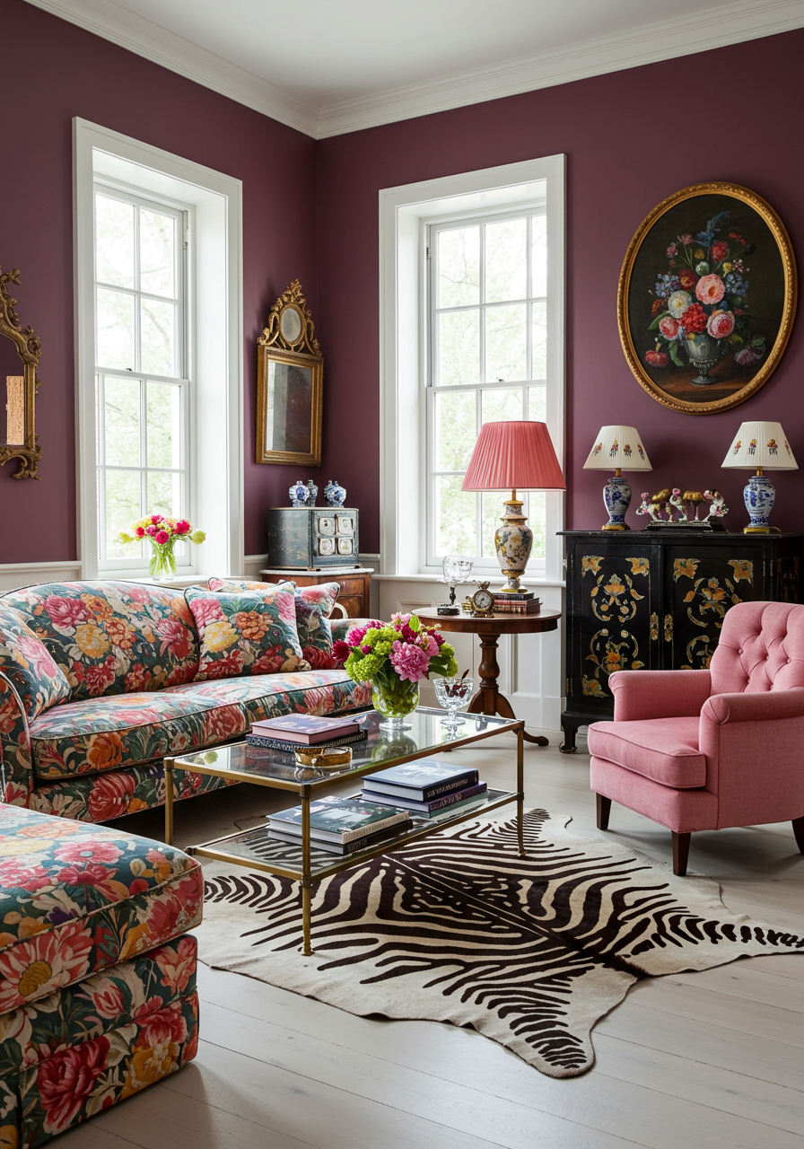
5. Striking Plum: A Jewel-Toned Touch
Earthy purples like plum and aubergine bring a rich, regal quality to interiors. These colors excel in spaces that demand a sense of warmth and intimacy, such as bedrooms or reading nooks.
Advanced Tip:
- Pair with contrasting textures like raw wood and polished marble for visual intrigue.
- Introduce complementary green accents to enhance the natural, earthy undertones of plum.
Why It Matters:
Plum hues blend the opulence of jewel tones with the grounded appeal of earthy colors, creating a versatile option for luxurious spaces.
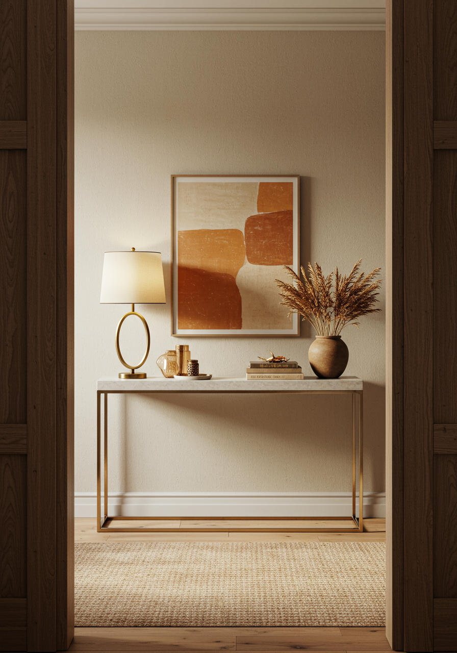
6. Honeyed Neutrals: The New Classic
Honeyed tones like terracotta and caramel are evolving neutrals that replace stark whites with warmth and depth. These colors are highly versatile and work well in minimalist and maximalist designs.
Advanced Tip:
- Use honeyed neutrals as a backdrop for bold patterns or textures, such as Moroccan tiles or geometric prints.
- Layer tonal variations for subtle depth—combine soft caramel with deeper amber for a cohesive palette.
Why It Matters:
These tones are timeless, offering a sense of comfort while maintaining sophistication in both modern and traditional designs.
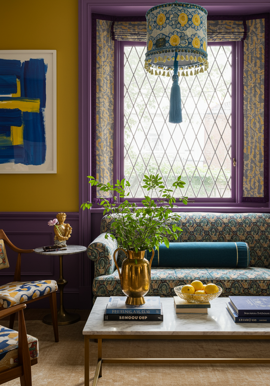
7. Artist’s Ochre: The Creative’s Palette
Ochre and mustard tones inject personality and charm into interiors. Perfect for bold, eclectic spaces, these colors shine when used in moderation.
Advanced Tip:
- Use ochre on feature walls or within statement furniture pieces like velvet sofas or leather chairs.
- Pair with black or deep green accents for a striking, modern aesthetic.
Why It Matters:
These tones provide a bridge between retro aesthetics and contemporary design, adding vibrancy without being overpowering.
8. Candied Tones: Playful Pops of Color
Candy-inspired hues like bright pinks and lilacs are perfect for adding whimsy and energy to spaces. These colors are ideal for accent pieces or eclectic designs.
Advanced Tip:
- Use candied tones sparingly in high-end spaces—opt for curated pieces like art, rugs, or accessories.
- Combine with muted tones to create contrast and prevent the space from feeling overly busy.
Why It Matters:
These hues encourage creativity and individuality, aligning with the growing demand for personalized interiors.
The Bottom Line
2025’s color trends are more than a visual refresh—they’re an opportunity to design spaces that reflect our evolving values, from sustainability to emotional well-being. Advanced designers can use these trends to craft interiors that are layered, meaningful, and uniquely beautiful.
Ready to take your designs to the next level? Explore these hues and reimagine your space with a palette that’s as thoughtful as it is stunning.
